The Challenge: Launching a new identity for a foundation-level brand in the NRL is traditionally a "no-win" scenario. Historically, new logo reveals in the NRL are met with scepticism and fan pushback.
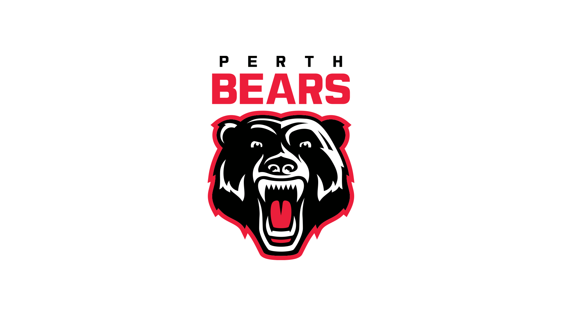
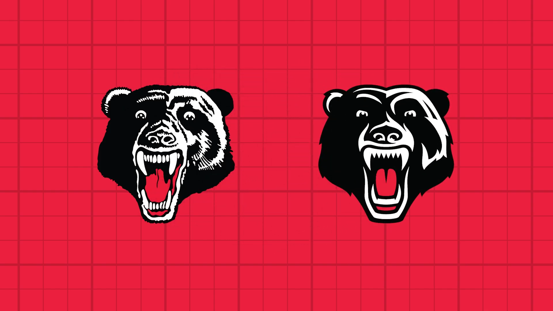
The Result: By honouring the deep heritage of the North Sydney Bears while building a sleek, modern symbol for the Perth market, the brand achieved a rare "unanimous win" across the national media landscape. The Perth Bears identity didn't just launch, it dominated.
Public Mandate: A Daily Telegraph reader poll saw an overwhelming 90% "Thumbs Up" approval rating. Touted by fans and commentators on social media as the one of the best logos in the game, widely recognised for breaking a long-standing cycle of poorly received NRL rebrands, with industry experts and supporters alike stating the project "nailed it."
The Impact: This wasn't just a logo design, it was a strategic brand architecture project that successfully united two distinct fan bases and stood up to the highest level of national media scrutiny.
“I can’t remember seeing such universal adulation for a logo release”.
- Dynasty Sport Head Designer Kit Lucev